1. Data Visualization in Python Course Introduction
If you’ve never created a chart in Python before, then this data visualization in Python course is for you. Seriously, though, even the most powerful analytical tools are still no match for the human brain with the human eyeball. And data visualization is just as powerful as any of the other data analytics, since it is people who still must make decisions based on data insights.
We have witnessed data growing faster than ever before, as information processing is increasingly more sophisticated. Visualizing data turns raw numbers into patterns we can see, revealing clear insights. This allows us to spot trends, outliers, and patterns. We do see now that every industry is relying more and more on visual data storytelling. This is because a strong visual presentation provides an edge in data-driven decision making.
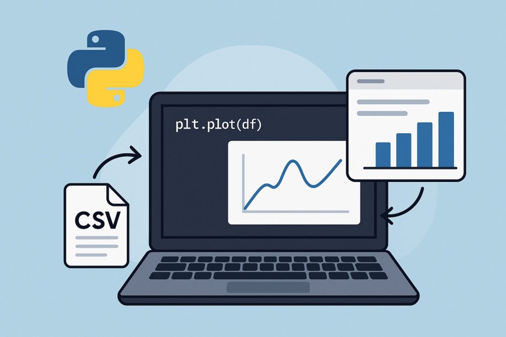
The course will show that Python is a powerful general-purpose language for data visualization, especially for quantitative data. Python’s power is that it supports many libraries that meet a variety of visualization needs. In this course, we’ll focus on three beginner-friendly libraries to create impactful visualizations. Matplotlib provides you with the ability to create detailed custom charts. On the other hand, Pandas makes it easy for you to plot data from tables. The other useful library is Amazon QuickSight, which adds scalable cloud dashboards.
2. What is Data Visualization in Python, and What Will You Learn from this Course?
Data analytics has its roots in the mathematical field of statistics, and historically, data visualization is core to statistics. Data visualization simply means displaying this data as charts or graphs that help to explain what the numbers mean. This course shows how to visualize data with Python. This will make patterns and trends clearer, since we can see them visually. These visuals can turn complex data into easy-to-grasp stories, and a good chart can reveal insights that raw data hides.
There are several different types of charts and graphs that reveal different aspects of data when visualized. Bar charts are helpful when we want to compare categories side by side. Whenever we want to see trends over time with connected data points, we select line charts. When we want to discover relationships or patterns between two variables, scatter plots are a good choice. We use heatmaps when we have large datasets and want to highlight patterns within these datasets.
This course will show how to perform data visualization with Python to discover patterns. We can then build a story around the data, leading to better decisions.
3. Why This Course on Data Visualization in Python?
The question is, why take this Python data visualization course instead of just using Excel or another BI tool? Well, Python is easy to use and has a rich ecosystem! You can use simple, readable syntax with Python, and it is beginner-friendly. This lends itself to writing powerful visualizations with only a few lines of code. Also, it works well with notebooks like Jupyter and Google Colab and provides great error messages.
Python’s rich ecosystem comprises libraries for each stage of the data workflow that support cleaning, visualization, and modeling. Visualization libraries include Matplotlib, Seaborn, Plotly, and Pandas, which are well-documented and widely used. Tools like Amazon QuickSight are available to integrate Python workflows with enterprise-scale dashboards.
Python’s other great advantage is that it is entirely free to download and use. Also, it has no license fees or subscriptions. Another key advantage is that it has the support of an open-source community with continual improvements. There is support for it everywhere from forums like Stack Overflow to thousands of tutorials and GitHub projects.
Python is a better choice than Excel when handling large datasets and complex transformations, where Excel can slow down or crash. There are powerful BI tools like Tableau and Power BI, but they often come with licensing costs. However, Python is free and customizable without locked-in features or limitations.
Finally, many real-world applications like finance and marketing research are written in Python. This proves that it is a powerful development tool that you can start using today.
4. Core Tools You’ll Learn in This Course for Data Visualization in Python
This course focuses on three Python libraries for data visualization: Matplotlib, Pandas, and Amazon Quicksight.
4.1 Matplotlib
Matplotlib is one of the core Python libraries that we can use to create static, animated, and interactive plots. Its inspiration came from MATLAB, and it is widely used in science and engineering. With just a few lines of code, you can quickly create bar, scatter, pie, and other chart types. It also provides you with complete control over every chart element, from colors to labels, and supports customization. Matplotlib integrates with Jupyter Notebooks for visual exploration, making it great for hands-on learning and experimentation. It also works with NumPy and Pandas, making it an integral part of any Python data workflow.
The following is a simple example of using Matplotlib to render a bar chart.
import matplotlib.pyplot as plt

# Sample data
months = ['Jan', 'Feb', 'Mar', 'Apr']
sales = [150, 200, 250, 300]

# Create bar chart
plt.bar(months, sales)

# Add labels and title
plt.xlabel('Month')
plt.ylabel('Sales')
plt.title('Monthly Sales')

# Show the chart
plt.show()
The following uses Matplotlib to render a line chart:
import matplotlib.pyplot as plt

# Sample data
months = ['Jan', 'Feb', 'Mar', 'Apr']
sales = [150, 200, 250, 300]

# Create line chart
plt.plot(months, sales, marker='o')

# Add labels and title
plt.xlabel('Month')
plt.ylabel('Sales')
plt.title('Monthly Sales Trend')
plt.grid(True)

# Show the chart
plt.show()
Matplotlib is flexible and highly customizable, and supports many chart types, making it a good choice for visualization. However, it has a steeper learning curve than Excel or BI tools and can have verbose syntax for complex plots. Here’s a quick summary of its key strengths and limitations.
✅ Pros of Matplotlib
- Flexible and highly customizable
- Works well with Pandas and NumPy
- Great for static, publication-quality charts
- Widely used and well-documented
- Supports many chart types
❌ Cons of Matplotlib
- Syntax can be verbose for complex plots
- Default styles can look outdated
- Limited interactivity without add-ons
- Steeper learning curve than Excel or BI tools
4.2 Pandas Visualization
Pandas visualization is built on Matplotlib, thereby extending it for creating quick visualizations directly from DataFrames using the .plot() method. That is why we are including it in this course for using Python for data visualization. It is highly useful for exploring data with line, bar, area, and histogram plots. Furthermore, existing Matplotlib functions are available for customizing charts even further.
The real power of built-in DataFrame methods is that you can generate charts with just one line of code. This makes it ideal when you need fast exploration with activities like data cleaning or analysis. Therefore, it provides quick visual feedback, allowing you to spot trends, outliers, or missing data instantly.
Here is a simple code example using Pandas to render a line chart from a CSV file.
import pandas as pd
import matplotlib.pyplot as plt

# Load data from CSV
df = pd.read_csv('monthly_sales.csv')

# Plot a simple line chart
df.plot(x='Month', y='Sales', kind='line', marker='o')

# Add labels and title
plt.xlabel('Month')
plt.ylabel('Sales')
plt.title('Monthly Sales Trend')

# Show the chart
plt.show()
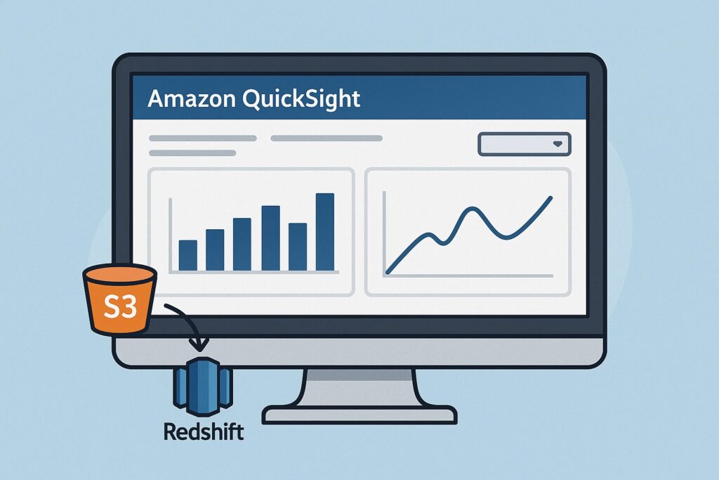
4.3 Amazon QuickSight
This course includes Amazon QuickSight for data visualization in Python because it enables integration with scalable cloud dashboards. Furthermore, QuickSight allows automated sharing of these dashboards across teams and scheduled report delivery. Also, Python can connect directly to AWS data sources like S3, Redshift, and Athena, enabling seamless integration.
Amazon QuickSight makes this easy through a drag-and-drop interface, allowing developers to build these dashboards visually. Another key benefit is that it integrates Python with its SDK, further extending the language.
5. Step-by-Step: Create Your First Python Data Visualization in this Course
This is the central part of this course that provides steps on achieving data visualization with Python libraries.
5.1 Setup
First, check if Python is already installed on your system, and if not, please install it. If you need to install Python, then you can download and install Python from the official website at https://www.python.org/downloads/. This page automatically suggests the correct version for your operating system.
Next, you need the matplotlib and pandas libraries, so use the pip command to download and install these libraries.
pip install matplotlib pandas
You will also want the Amazon QuickSight SDK, so install this using the pip command.
pip install amazon-quicksight-sdk
Also, look at installing these within a virtual environment for a clean project setup. For setting up within a virtual environment, please refer to https://docs.python.org/3/library/venv.html.
5.2 Load Sample Dataset
We next want to write code that loads the dataset for visualization. Therefore, for learning purposes, use a simple CSV file holding your data. Then, at the beginning of your code, import the Pandas library with import pandas as pd.
Next, write the code that loads data from the CSV file using Pandas pd.read_csv(). When you call this function, it results in storing the data in a DataFrame for easy handling. Make sure to use the full path to your CSV file if it’s not in the same directory as your script. If you want to preview the first few rows in your dataset, then use df.head().
5.3 Visualize the Data using Python Libraries
Once you have loaded your data into your DataFrame, you can use df.plot() to quickly create charts from it. When calling this function, you can select the chart type by adding kind=’line’, ‘bar’, or ‘hist’. Additionally, you can label the chart and its axes by using Matplotlib’s plt.title(), plt.xlabel(), and plt.ylabel(). Whenever gridlines are needed, call plt.grid(True). Finally, to display the final chart, invoke plt.show().
These steps are itemized below.
| Step | Description |
|---|---|
| 1 | Use df.plot() to quickly create charts from your DataFrame. |
| 2 | Add kind='line', 'bar', or 'hist' to choose the chart type. |
| 3 | Use Matplotlib’s plt.title(), plt.xlabel(), and plt.ylabel() for labels. |
| 4 | Call plt.grid(True) to add gridlines for better readability. |
| 5 | Display the final chart with plt.show(). |
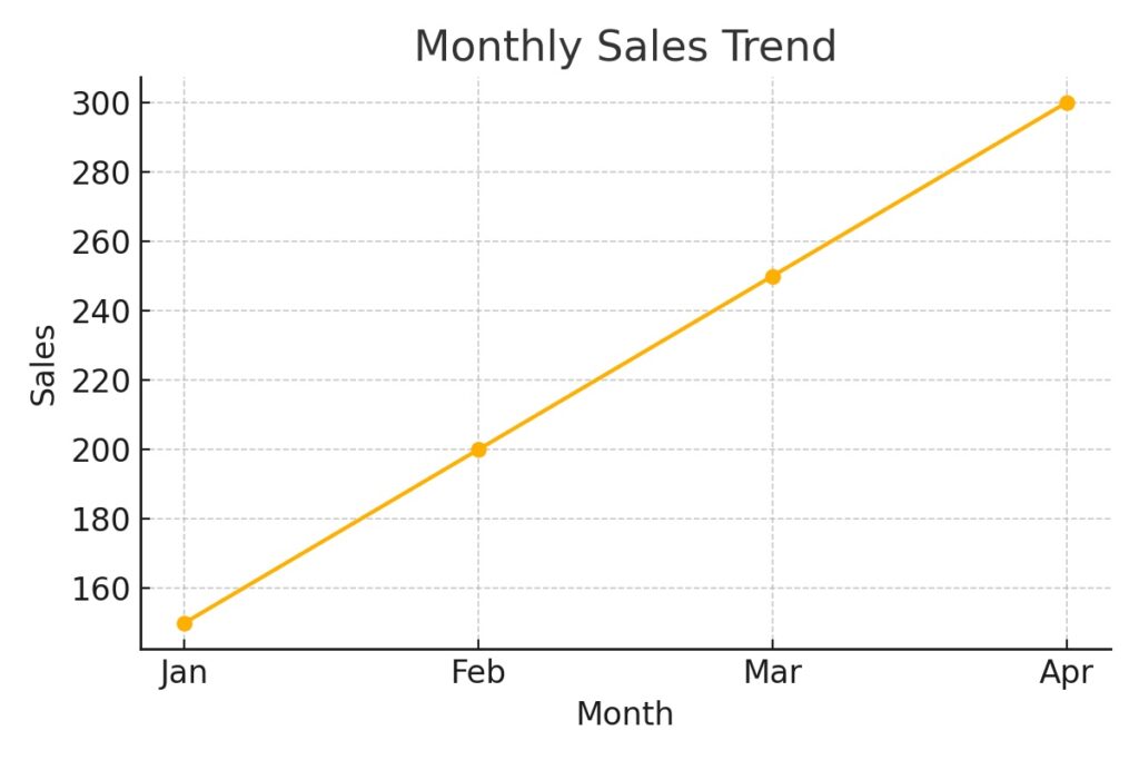
5.4 Simple Chart
Once the chart is created then it will display your data visually, making it easier to spot patterns. Also, the axis labels that you specify will show what each side of the chart represents. Meanwhile, the title will show the context of the data that the chart is displaying. Subsequently, data points in the CSV file columns are plotted with gridlines and markers, making trends and differences more straightforward.
For this data.
| Month | Sales |
|---|---|
| Jan | 150 |
| Feb | 200 |
| Mar | 250 |
| Apr | 300 |
We have this chart.
5.5 Sample Code
Here is the code for creating a chart.
import pandas as pd
import matplotlib.pyplot as plt

# Sample data
data = {
    'Month': ['Jan', 'Feb', 'Mar', 'Apr'],
    'Sales': [150, 200, 250, 300]
}
df = pd.DataFrame(data)

# Create a line chart
plt.figure(figsize=(6, 4))
plt.plot(df['Month'], df['Sales'], marker='o')
plt.title('Monthly Sales Trend Line Chart Using Pandas and Matplotlib')
plt.xlabel('Month')
plt.ylabel('Sales')
plt.grid(True)

# Save the image
plt.savefig('monthly-sales-trend-line-chart-python.png')
plt.show()
6. Tips for Beginners
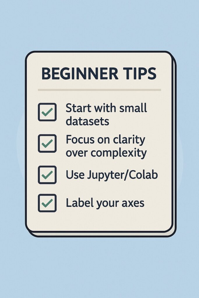
When starting out, there are some simple guidelines that this course provides when using Python to visualize data. The first point is to use small datasets because they are easier to understand and debug while learning. They also load quickly and reduce any risks of memory or performance issues. Another point is that you can see clearly how each data point affects your visualization. Also, you can more easily spot mistakes in your code or data when working with fewer rows.
Also, when beginning, it is wise to focus on clarity over complexity. This is because you can better understand a simple, well-labeled chart over a dense or overloaded one. You also want your chart to tell a clear story instead of showing off every possible feature. Additionally, use clean colors, readable fonts, and minimal clutter; this helps to highlight key insights.
Also, when starting out, make use of either Jupyter Notebook or Google Colab. These allow you to run your code in real time and provide instant feedback, allowing you to master data visualization.
Another essential point to remember is to label your axes and titles, but nothing complex. You want your chart to tell a simple story that is easily understandable.
Once you’re confident working with small datasets, you can explore how data pipelines are used in machine learning with our guide on efficient TensorFlow data pipelines.
7. What to Learn Next After This Course on Data Visualization with Python
This course only scratches the surface of using Python for visualizing data, and there is far more to learn. Each of the tools presented here is a field of study in itself, and the beginner can start by exploring them in more detail.
To further explore Matplotlib, check out the Matplotlib Official tutorials that are comprehensive and beginner-friendly. They are maintained by core developers and are tutorials written by developers for developers.
Exploring Pandas, please check out Pandas Visualization Guide, which covers .plot() API, chart types, and Matplotlib integration, is clearly explained.
There are also other powerful libraries that further enhance Python for data visualization. Seaborn is also built on Matplotlib, and users can create beautiful and informative graphics with a few lines of code. Another library is Plotly, which is a Python graphing library that enables interactive, web-based visualizations. These include line charts, scatter plots, and dashboards, all created with ease.
8. Wrap Up on Data Visualization Python Course
Data visualization has been a core element of statistics ever since it emerged as a field of study. It presents information that quantities themselves are unable to represent, and data visualization is central to any analytics effort. Ultimately, the purpose of analytics is to derive insights from data, and visualization is a simple but effective method to achieve this. Python is a powerful tool for data visualization, as this course has demonstrated. Not only is it powerful, but it is easy to use, making it ideal for anyone starting out with data visualization.
You can easily follow the steps above to accomplish your first data visualization, thus starting your journey in this important field.
9. Further Reading
Data Visualization with Python and JavaScript by Kyran Dale
A hands-on book that bridges Python and front-end tools for dynamic, web-based data visualizations.
Python Data Science Handbook by Jake VanderPlas
A comprehensive guide to using Python for data science, with solid chapters on Pandas, Matplotlib, and visualization best practices.
Interactive Data Visualization with Python by Abha Belorkar
Focuses on interactive dashboards and tools like Plotly and Dash—great for going beyond static charts.
Effective Python: 90 Specific Ways to Write Better Python
While not focused solely on visualization, this book is excellent for writing cleaner, more efficient Python code that supports your analytics workflows.
Practical Statistics for Data Scientists
A highly approachable guide to applying statistical thinking, paired well with your data visualization skills.
Disclosure:
As an Amazon Associate, we earn from qualifying purchases. This helps support the content on AI Cloud Data Pulse at no extra cost to you.