Introduction to t-SNE Machine Learning
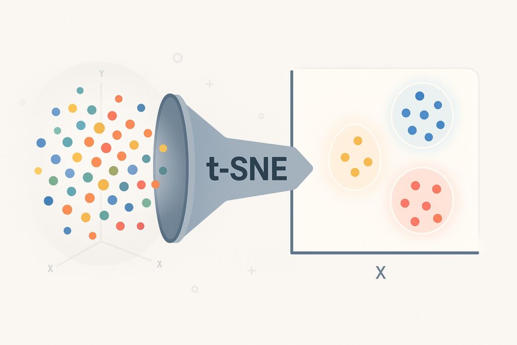
Traditional plots for high-dimensional data have serious limitations, making t-SNE machine learning crucial for modern data scientists. t-SNE is a powerful tool that allows us to visualize high-dimensional data in two or three dimensions. It also enables us to uncover structure and patterns that are hidden in the raw feature space. When applied to machine learning, engineers often use it for exploratory data analysis and model diagnosis. Its main strengths are working with complex datasets, where it excels in revealing clusters, subgroups, and anomalies. This technique guides feature engineering and interpretation by reducing dimensions while preserving local relationships.
Traditional plotting is ineffective in many scenarios because modern datasets contain dozens or hundreds of features. However, we still need to understand these datasets, and we will always need visualization. This includes fields like bioinformatics, NLP, and computer vision for understanding embeddings.
t-SNE has developed into an effective technique for visualizing modern, complex datasets that is beyond traditional plotting’s abilities. It provides the means by which we can translate complex relationships into intuitive visual patterns. Instead of statistical summaries, t-SNE provides a visual sense of data density and neighborhood structure. It can often reveal hidden insights for validating clustering algorithms or exploring raw data.
We will uncover how t-SNE works under the hood and which use cases to include it within machine learning workflows. Additionally, we will show how to apply t-SNE using Python with scikit-learn.
What is t-SNE?
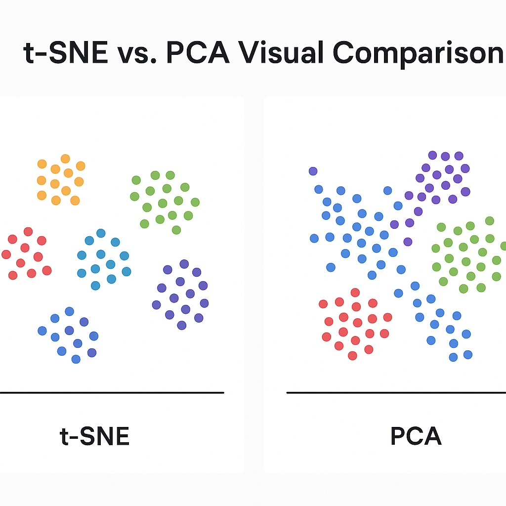
t-SNE is an abbreviation of t-Distributed Stochastic Neighbor Embedding. Machine learning pioneers Laurens van der Maaten and Geoffrey Hinton developed it back in 2008. They specifically designed it for visualization by making it a nonlinear dimensionality reduction method. It focuses on preserving local relationships between data points, in contrast to PCA, which focuses on preserving global structure. It primarily aims to position similar points close together within a lower-dimensional space.
t-SNE’s core value lies in its ability to explore hidden patterns in high-dimensional datasets. This makes it primarily a visualization tool. It is not designed for feature selection or downstream modeling tasks. Therefore, its ideal position within machine learning workflows is after normalization or principal component analysis (PCA).
Often, data scientists use it to evaluate clustering performance or to identify natural groupings. This has resulted in its adoption for exploratory data analysis in understanding embedding, latent variables, and data structures. In fact, it quickly gained popularity given its ability to reveal structures in complex datasets.
t-SNE plots are used by ML engineers to visually validate the performance of unsupervised learning algorithms in grouping similar instances. This is especially helpful when labels are missing or incomplete, giving engineers a visual way to assess data quality.
One of t-SNE’s key strengths is its ability to bridge raw data and human interpretation. Therefore, many Python libraries have adopted it for seamless experimentation, including scikit-learn and TensorFlow. Although it is a powerful algorithm, we must take care in interpreting its plots. This is because distances in the output plots are not always globally meaningful.
Another advantage that t-SNE visualization offers is that it can present insights to non-technical stakeholders. Overall, both academic research and industry have adopted t-SNE as a standard part of their data exploration workflows.
How t-SNE Machine Learning Works
We now look at how t-SNE machine learning works, given its wide adoption in academia and industry. It compares pairwise similarities in high dimensions and then projects them into a low-dimensional space, preferably 2D or 3D. Finally, it minimizes the divergence between the high-dimensional and low-dimensional spaces using Kullback-Leibler divergence.
Pairwise Similarity Comparison
In order to compare pairwise similarities, t-SNE calculates the similarity of each pair of points in the original high-dimensional space. The similarity score for two points measures their closeness in high-dimensional space. The closer they are, the higher their similarity score is. Next, t-SNE converts these similarities into conditional probabilities reflecting the likelihood that one point will pick another as its neighbor. Therefore, the algorithm models this similarity using a Gaussian distribution centered at each point. This results in a probability distribution that captures the local neighborhood structure across all points. t-SNE uses these pairwise similarities to form the foundation of its lower-dimensional mapping.
Low-Dimensional Space Projection
To project these similarities in a low-dimensional space, t-SNE machine learning initializes the points in a low-dimensional space. t-SNE usually performs this with small random values. Next, it defines a similar probability distribution over these low-dimensional points. However, now instead of using a Gaussian distribution, it uses a Student’s t-distribution with one degree of freedom. Using this distribution results in heavier tails, which helps avoid crowding in the center of the map. The goal here is to match as closely as possible the low-dimensional similarities to those in high dimensions. However, the two distributions still differ, and t-SNE works to minimize this gap.
Divergence Reduction
t-SNE now uses the Kullback-Leibler (KL) divergence to measure the difference between the high and low-dimensional similarity distributions. The t-SNE algorithm treats the KL divergence as a cost function and minimizes this using gradient descent. t-SNE penalizes mismatches whenever similar points in high-dimensional space are placed far apart in low-dimensional space. However, it does not penalize as heavily whenever dissimilar points are placed close together, due to its asymmetric nature. It then uses gradient descent to adjust the low-dimensional points, reducing the divergence iteratively. After sufficient iterations, the low-dimensional layout converges to a map that best preserves local structures for the original data.
Use cases in t-SNE Machine Learning
Now that we have an elementary understanding of how t-SNE machine learning works, let’s consider some real-world use cases.
Visualizing Embeddings
A wide use of t-SNE is visualizing word embeddings, such as word2vec and GloVe, in 2D spaces. This visualization helps to reveal semantic relationships between words by clustering similar terms together. Applying t-SNE to BERT embeddings can show how sentence meanings are organized in the vector space. The visualizations that t-SNE provides are valuable for understanding how language models represent meaning and context.
Evaluating Clustering
Another valuable use of t-SNE is visually assessing where clusters formed by algorithms like K-means are well-separated. We can quickly identify overlaps or outliers, indicating poor clustering or suboptimal parameters. This visual feedback is particularly useful whenever true labels are not available. t-SNE is commonly used to compare clustering outputs across different feature sets or methods.
Debugging Features
t-SNE is also helpful for debugging feature representations. This is where t-SNE helps to identify whether similar data points are grouped together in feature space. Here, t-SNE can reveal where feature engineering fails to capture meaningful structure in the dataset. Whenever the t-SNE plot reveals unexpected clustering, this may indicate mislabeled or noisy outputs. Therefore, t-SNE can guide adjustments to model architecture or preprocessing steps by visualizing learned features.
Fraud and Anomaly Detection
t-SNE also plays a crucial role in fraud and anomaly detection. Here, it can highlight rare or unusual data points that appear isolated from natural clusters. This is important in fraud detection in that it helps to visualize deviations from normal behavior patterns. These anomalies clearly stand out in t-SNE plots even when hidden in high-dimensional space. Therefore, these visual cues can support investigative workflows and model refinement.
Python implementation with sklearn
We will now use scikit-learn for a hands-on demonstration of t-SNE machine learning, utilizing the Scikit-Learn Python library. This demonstration was done on a MacBook Pro with the M4 Pro Max, 48 GB of RAM, and 1 TB SSD.
Setup
Ensure Python is already installed, and if not, then install from https://www.python.org/downloads/ (The page will automatically suggest the correct version for your operating system).
Once we have set up a virtual environment, we upgrade our pip and install the following libraries:
- numpy
- pandas
- scikit-learn
- matplotlib
- seaborn
t-SNE Machine Learning Sample Dataset
An ideal dataset that demonstrates the use of t-SNE machine learning is the digits dataset. It is highly dimensional with 8×8 pixels, therefore having 64 features per sample with clear visual clusters (digits 0-9). This makes it perfect for illustrating how t-SNE compresses high-dimensional data into a 2D map with grouped digit clusters.
For those who are more adventurous and want to try something after our demonstration, consider exploring the MNIST dataset. It consists of images of pixel size (28×28), providing 784 features per sample. This is more realistic for t-SNE machine learning problems. However, because it requires more time and memory, it is less ideal for the beginner.
Startup Jupyter Notebook
The code to perform t-SNE using Scikit-learn on the Digits is run on Jupyter Notebook. To start the Jupyter notebook, execute the statement below:
jupyter notebook
This launches a browser with the local Jupyter notebook as the web page.
Import Libraries and Load the Digits Dataset
Here we set up a foundation for preprocessing running t-SNE using Scikit-Learn.
We import our libraries.
import numpy as np
import pandas as pd
import matplotlib.pyplot as plt
import seaborn as sns

from sklearn.datasets import load_digits
from sklearn.manifold import TSNE
Next, we load the Digits dataset.
from sklearn.datasets import load_digits

digits = load_digits()
X = digits.data
y = digits.target
We also do a sanity check, but that is perfectly optional with you.
print(X.shape) # (1797, 64)
Standardize the Features
For t-SNE using Scikit-learn to work properly, we must standardize the features so they have zero mean and unit variance.
from sklearn.preprocessing import StandardScaler

scaler = StandardScaler()
X_scaled = scaler.fit_transform(X)
Apply t-SNE using Scikit-Learn from sklearn.manifold
Finally, we are ready to apply t-SNE to our Digits dataset using the following code. This code will reduce the vector space to 2D for plotting.
tsne = TSNE(n_components=2, random_state=42, perplexity=30)
X_tsne = tsne.fit_transform(X_scaled)
You may get error messages with runtime warnings. If you do, then run the code below that applies t-SNE with lower perplexity.
tsne = TSNE(n_components=2, random_state=42, perplexity=20)
X_tsne = tsne.fit_transform(X_scaled)
In some cases, we still encountered runtime warnings, which required us to do the following:
- Setting the initialization method to PCA instead of Random
- Set a higher learning rate
With reference to the second point, t-SNE has a known quirk of learning rate sensitivity that causes instability. The code used is:
tsne = TSNE(
    n_components=2,
    random_state=42,
    perplexity=30,
    learning_rate=200,
    init='pca'
)
X_tsne = tsne.fit_transform(X_scaled)
Plotting the t-SNE Machine Learning Results
Now that we have applied t-SNE machine learning, we want to visualize our results. The first step is to create a data frame for plotting, so it is easier to visualize with seaborn.
df_tsne = pd.DataFrame({
    'x': X_tsne[:, 0],
    'y': X_tsne[:, 1],
    'label': y
})
We render a plot using the seaborn library with the following code.
plt.figure(figsize=(10, 6))
sns.scatterplot(data=df_tsne, x='x', y='y', hue='label', palette='tab10', s=60)
plt.title("t-SNE Visualization of Digits Dataset")
plt.xlabel("t-SNE Component 1")
plt.ylabel("t-SNE Component 2")
plt.legend(title="Digit", bbox_to_anchor=(1.05, 1), loc='upper left')
plt.tight_layout()
plt.show()
From running this code, we got the following plot.
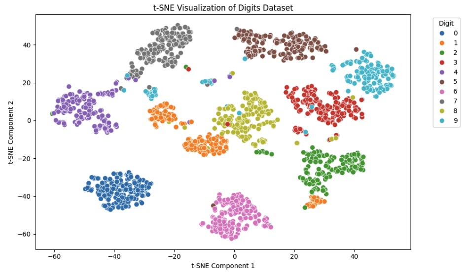
Interpreting the t-SNE Machine Learning Results
From our plot, we can readily see that t-SNE machine learning ensured that each digit forms a distinct cluster. This confirms t-SNE’s ability to preserve local relationships in the data.
We also notice that digits like 3, 8, and 9 show the most overlap, suggesting visual similarity in the pixel patterns. The digit 1 appears more dispersed, suggesting greater variation in how it is written or encoded.
The plot clearly demonstrates how t-SNE compresses 64-dimensional data into a meaningful 2D structure for further exploration.
t-SNE Machine Learning Parameter Tuning & Best Practices
As we have seen from our demonstration, we needed to do some tuning when applying t-SNE machine learning. We will explore these in more detail, given that t-SNE is a machine learning model itself using gradient descent. Therefore, the issues associated with gradient descent models also apply to t-SNE, which we need to address. The three major parameters that we need to adjust, shown in the demonstration, are perplexity, learning rate, and iterations.
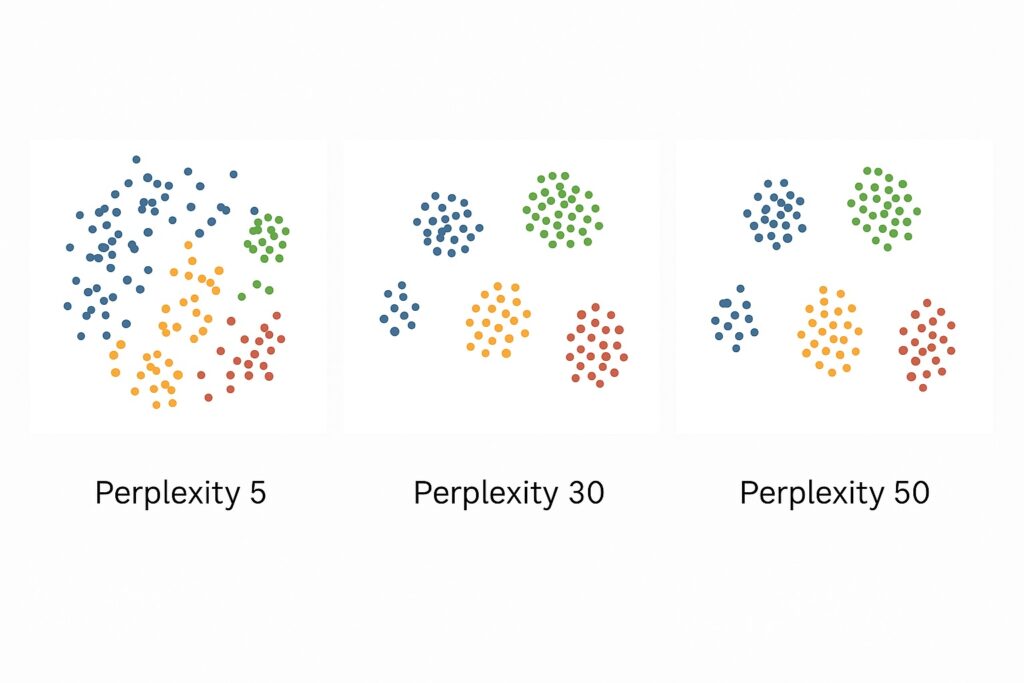
Perplexity
Perplexity enables engineers to control the number of effective nearest neighbors that the t-SNE machine learning considers for each point. At the lower end of the scale, low perplexity values place emphasis on local structure, capturing fine-grained clusters. At the other end of the spectrum, higher perplexity values smooth the embedding and reveal broader global patterns. Typically, perplexity values usually range from 5 to 50, depending on dataset size and density. Should perplexity be too low, then this may lead to fragmented or noisy clusters in the output. On the other hand, when perplexity is too high, distinct groups may become blurred, making the visualization less informative. Therefore, perplexity tuning is an essential part of the machine learning workflow. Engineers and data scientists should experiment with several values to yield the most insightful results.
Learning Rate
This is a crucial parameter for gradient descent algorithms, including t-SNE machine learning. This determines how quickly these algorithms (including t-SNE) update their point positions during optimization. Using a learning rate that is too low can cause points to clump tightly and distort the structure. However, a learning rate that is too high can cause points to scatter excessively and produce noisy plots. A range that has values between 100 and 1000 is often effective for datasets with hundreds to thousands of samples. Whenever t-SNE outputs are overlapping or are collapsed clusters, then increasing the learning rate is a common fix.
Iterations
As a gradient descent algorithm, t-SNE machine learning employs iterations to gradually minimize the KL divergence for stable embeddings. In many cases, the default 1,000 iterations may be insufficient for complex or noisy datasets. Here, increasing the number of iterations to 2,000 or more may yield better convergence and clearer visualizations. Selecting too few iterations may result in unstable or misleading point arrangements.
Other considerations
As shown in the above demonstration, we decided to start with PCA for initial dimensionality reduction instead of random values. There are several reasons, including noise reduction, speed, stability, and control of overfitting. The most significant value lies in deriving value from the best of both worlds. Here, PCA preserves the global structure, while t-SNE captures the local structure.
A pitfall to avoid is over-interpreting the distances between clusters. Because t-SNE emphasizes local structure, distances between clusters may not necessarily reflect true relationships in high-dimensional space.
Comparison with PCA
We have considered t-SNE machine learning and PCA in a previous post. Each has different use cases that they are well-suited for, and we will now consider these here. One point to make that we explored earlier is that when using t-SNE, we also use PCA to initialize the data. This is because PCA helps by reducing initial dimensionality, speeding up t-SNE computation, and minimizing noise.
PCA
We should select PCA when our dataset has many correlated linear features, which PCA can resolve into orthogonal axes. Here, it also removes any multicollinearity prior to regression or classification tasks. Associated with these use cases is the ability for it to compress data while preserving variance. In these scenarios, PCA is a fast and efficient dimensionality reduction technique we can use in our machine learning workflow. It is also a crucial pre-processing step for machine learning workflows, particularly prior to clustering or visualization. Another use case is when datasets have low-variance components that we can remove, and we want to denoise high-dimensional data. Whenever we use PCA, we need to ensure that our data is structured and numeric in an Euclidean space.
t-SNE Machine Learning
Whenever there are non-linear relationships in our data that linear methods miss, we should use t-SNE machine learning. We also use t-SNE when we want to visually explore clusters in high-dimensional data. We need to remember that some degree of human oversight is always needed in any machine learning workflow. This also extends to wanting to understand embedding spaces, such as word or image vectors. Also, it allows us to visualize complex datasets in 2D or 3D.
Another important scenario is when local neighborhood preservation is more important than global structure.
Overall, t-SNE’s main use case is in the exploratory phase of machine learning. This allows data scientists and engineers to tune their workflows better. It is less well suited for downstream processing. Also, remember when using t-SNE that you will have slower computation in exchange for visual insight.
t-SNE Machine Learning Final Thoughts
Our central point is that t-SNE machine learning is a valuable tool for visualizing high-dimensional, non-linear data. This is especially true when it can help to reveal hidden clusters and patterns obfuscated by traditional plotting. It is better used for exploratory analysis by engineers and data scientists than for predictive modeling. We have also highlighted that engineers need to perform careful tuning of parameters, including perplexity and learning rate. Also, combining t-SNE with PCA can improve speed and reduce noise before visualization.
It is important to iterate that t-SNE is not a modeling step. All machine learning workflows will require some degree of human intervention. This is the job of machine learning engineers and data scientists. t-SNE is one tool for certain classes of data that allows more effective human intervention.
If you had followed along with the demonstration above, then you are well placed to continue experimentation and exploration. As a first step, you may want to explore the MNIST dataset with images of pixel size (28×28). These provide 784 features per sample, making it a superb dataset for understanding t-SNE transformations better.
Further Reading
Hands-On Machine Learning with Scikit-Learn, Keras, and TensorFlow (3rd Edition)
Aurélien Géron
Learn t-SNE and PCA through real-world projects in Python
Python Machine Learning (3rd Edition)
Sebastian Raschka & Vahid Mirjalili
Master t-SNE and advanced ML workflows with Python
Data Visualization: A Practical Introduction
Kieran Healy
Sharpen your storytelling with clear, effective data visualizations
The Elements of Statistical Learning (2nd Edition)
Trevor Hastie, Robert Tibshirani, Jerome Friedman
Build strong theoretical foundations for dimensionality reduction
Interpretable Machine Learning
Christoph Molnar
Understand t-SNE and model behavior with this visual ML guide
Disclosure: This page includes affiliate links to books on Amazon. If you click through and make a purchase, I may earn a small commission at no additional cost to you. This helps support the blog and allows me to continue providing quality content. Thank you!
References
van der Maaten, L., & Hinton, G. (2008).
Visualizing data using t-SNE. Journal of Machine Learning Research, 9(Nov), 2579–2605.
The original paper that introduced t-SNE.
scikit-learn documentation. (n.d.).
sklearn.manifold.TSNE.
Official API and usage examples for TSNE.
Wattenberg, M., Viégas, F., & Johnson, I. (2016).
How to Use t-SNE Effectively. Distill.
Excellent visual guide to interpreting t-SNE plots and common pitfalls.
Pedregosa, F., Varoquaux, G., Gramfort, A., Michel, V., Thirion, B., Grisel, O., … & Duchesnay, E. (2011).
Scikit-learn: Machine learning in Python. Journal of Machine Learning Research, 12, 2825–2830.
Foundational paper on the library you used for implementation.
Chan, C. S., & Vasconcelos, N. (2005).
Probabilistic kernels for the classification of auto-annotated images.
In CVPR 2005 (Vol. 2, pp. 846–851). IEEE.
→ Cited by van der Maaten in early work, offers deeper insight into manifold-based approaches.